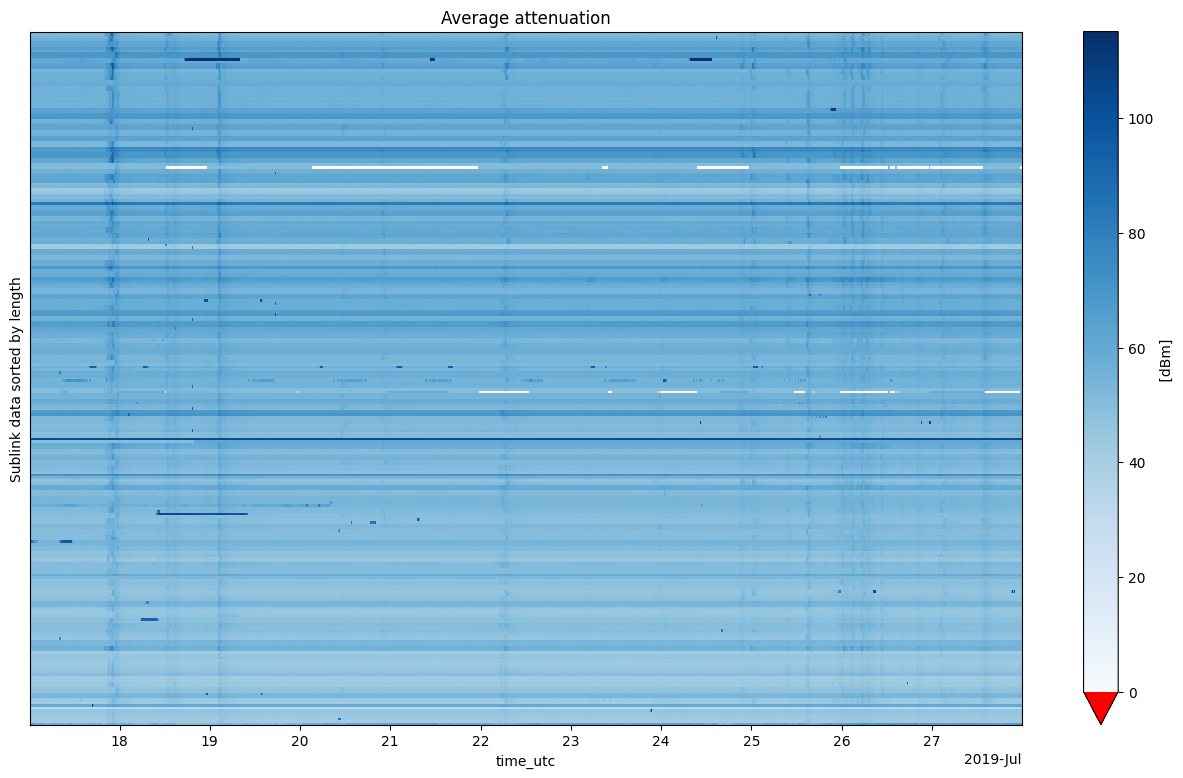
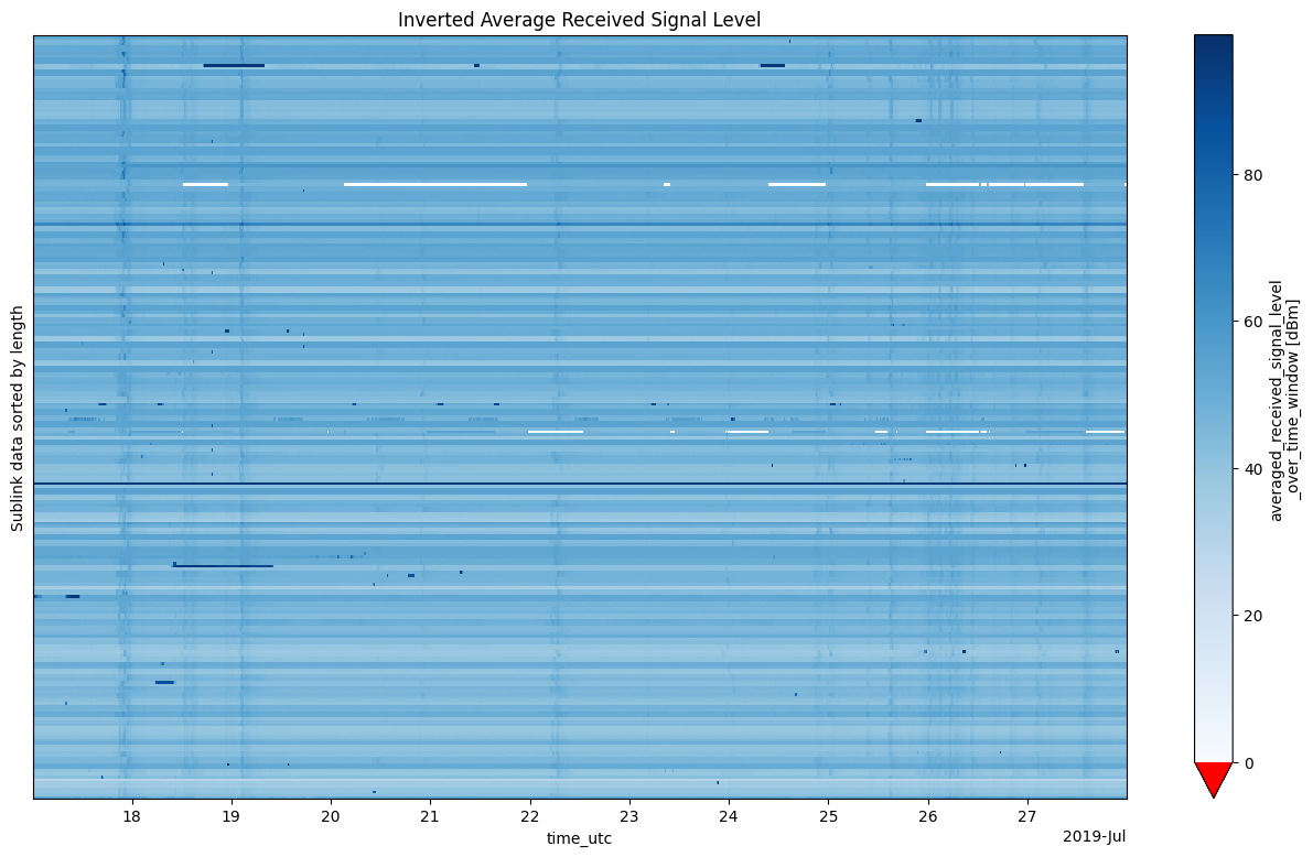
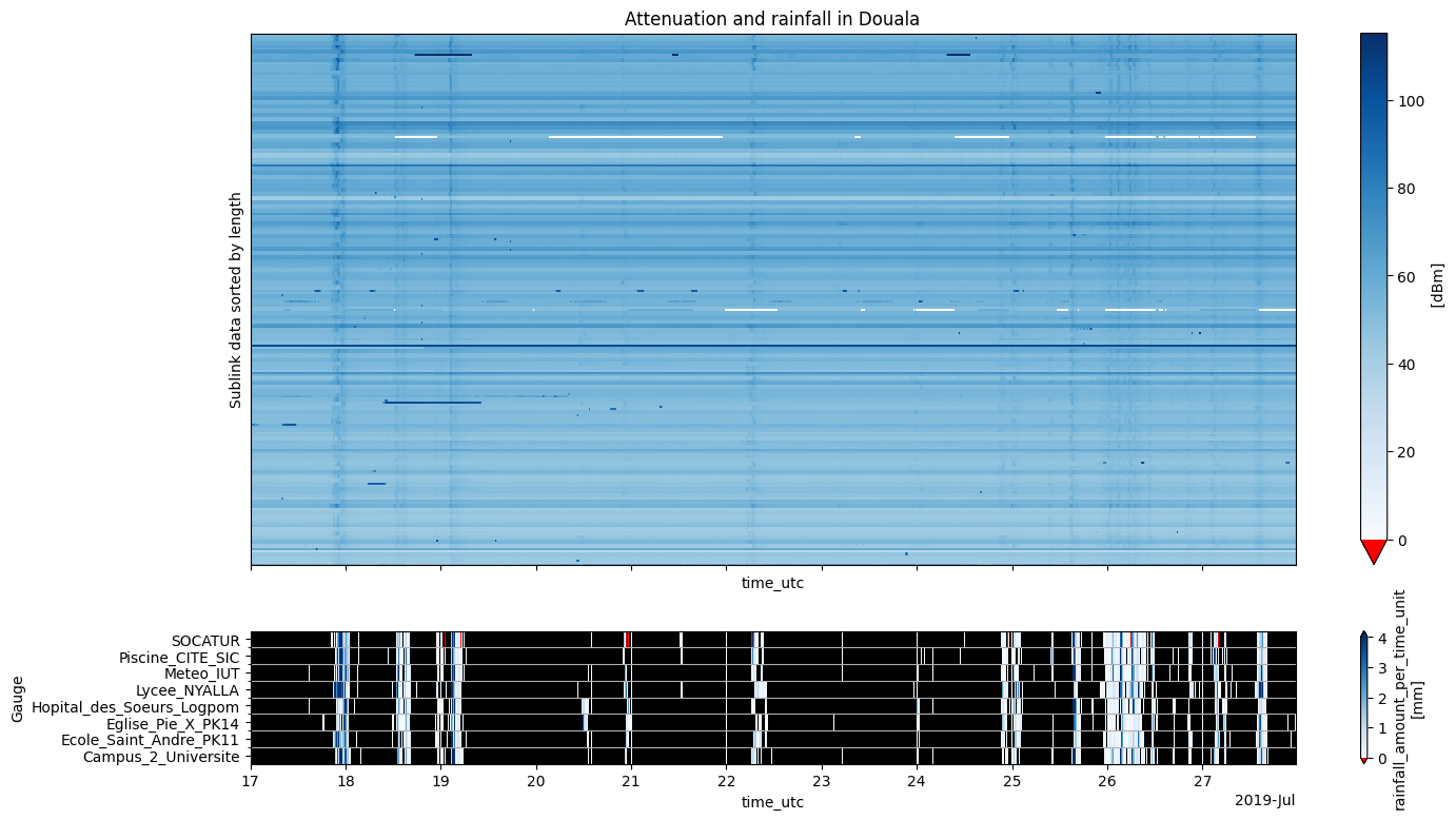
<xarray.DataArray (cml_id: 126, sublink_id: 6, time: 1052)> Size: 6MB
57.5 57.6 57.6 57.6 57.6 57.7 57.7 57.7 57.7 ... nan nan nan nan nan nan nan nan
Coordinates: (10)
Attributes:
    units:    dBm
xarray.DataArray
- cml_id: 126
- sublink_id: 6
- time: 1052
- 57.5 57.6 57.6 57.6 57.6 57.7 57.7 ... nan nan nan nan nan nan nan
array([[[57.5, 57.6, 57.6, ..., 58.7, 58.7, 58.6], [56.6, 56.6, 56.6, ..., 57.5, 57.5, 57.4], [ nan, nan, nan, ..., nan, nan, nan], [ nan, nan, nan, ..., nan, nan, nan], [ nan, nan, nan, ..., nan, nan, nan], [ nan, nan, nan, ..., nan, nan, nan]], [[60.6, 60.6, 60.8, ..., 59.1, 59.1, 59.1], [61.2, 61.2, 61.2, ..., 58.5, 58.5, 58.5], [ nan, nan, nan, ..., nan, nan, nan], [ nan, nan, nan, ..., nan, nan, nan], [ nan, nan, nan, ..., nan, nan, nan], [ nan, nan, nan, ..., nan, nan, nan]], [[46.6, 46.6, 46.6, ..., 47.3, 47.3, 47. ], [45.7, 45.7, 45.6, ..., 46.2, 46. , 45.8], [ nan, nan, nan, ..., nan, nan, nan], [ nan, nan, nan, ..., nan, nan, nan], [ nan, nan, nan, ..., nan, nan, nan], [ nan, nan, nan, ..., nan, nan, nan]], ... [[50.6, 50.6, 50.5, ..., 51.1, 51.4, 51.4], [49.5, 49.6, 49.5, ..., 50.2, 50.7, 50.7], [ nan, nan, nan, ..., nan, nan, nan], [ nan, nan, nan, ..., nan, nan, nan], [ nan, nan, nan, ..., nan, nan, nan], [ nan, nan, nan, ..., nan, nan, nan]], [[53.9, 53.9, 53.9, ..., 54.5, 54.6, 54.7], [53.8, 53.9, 53.8, ..., 54.3, 54.4, 54.6], [ nan, nan, nan, ..., nan, nan, nan], [ nan, nan, nan, ..., nan, nan, nan], [ nan, nan, nan, ..., nan, nan, nan], [ nan, nan, nan, ..., nan, nan, nan]], [[47. , 47. , 47. , ..., 47.6, 47.9, 47.9], [46.4, 46.5, 46.5, ..., 47.3, 47.6, 47.9], [ nan, nan, nan, ..., nan, nan, nan], [ nan, nan, nan, ..., nan, nan, nan], [ nan, nan, nan, ..., nan, nan, nan], [ nan, nan, nan, ..., nan, nan, nan]]], shape=(126, 6, 1052)) - cml_id(cml_id)<U19'3.984686N-9.789517E' ... '4.095...
- long_name :
- commercial_microwave_link_identifier
array(['3.984686N-9.789517E', '3.985691N-9.801648E', '3.996996N-9.761328E', '4.002892N-9.746861E', '4.007006N-9.767519E', '4.008236N-9.788792E', '4.013028N-9.703569E', '4.013180N-9.765819E', '4.014916N-9.732514E', '4.015776N-9.756458E', '4.016656N-9.736544E', '4.016736N-9.764944E', '4.016944N-9.753305E', '4.016962N-9.726686E', '4.017736N-9.748042E', '4.018721N-9.762325E', '4.018764N-9.746583E', '4.019750N-9.767776E', '4.019930N-9.759403E', '4.020440N-9.708914E', '4.021256N-9.746180E', '4.021528N-9.798792E', '4.024043N-9.680260E', '4.024381N-9.733274E', '4.024750N-9.697977E', '4.025125N-9.770912E', '4.025270N-9.739593E', '4.025625N-9.735889E', '4.025880N-9.703252E', '4.026149N-9.695650E', '4.028700N-9.729934E', '4.028708N-9.703542E', '4.029412N-9.691581E', '4.030556N-9.705569E', '4.030907N-9.694160E', '4.031399N-9.698080E', '4.032132N-9.730055E', '4.032560N-9.713835E', '4.033181N-9.761500E', '4.033883N-9.691732E', '4.034149N-9.772296E', '4.034701N-9.729347E', '4.035134N-9.697875E', '4.035679N-9.685969E', '4.037778N-9.767028E', '4.038505N-9.704950E', '4.039270N-9.722472E', '4.039580N-9.737019E', '4.040098N-9.700828E', '4.040792N-9.776750E', '4.041057N-9.688122E', '4.041068N-9.758319E', '4.041256N-9.730708E', '4.041347N-9.773597E', '4.042298N-9.740333E', '4.042502N-9.716614E', '4.042568N-9.698128E', '4.042817N-9.705986E', '4.043833N-9.687306E', '4.043927N-9.704314E', '4.044597N-9.727069E', '4.044736N-9.710024E', '4.047503N-9.718511E', '4.048013N-9.705195E', '4.048153N-9.698625E', '4.048916N-9.707667E', '4.049925N-9.774582E', '4.050150N-9.740475E', '4.050347N-9.703473E', '4.050528N-9.753875E', '4.052083N-9.788583E', '4.054458N-9.763403E', '4.055917N-9.752681E', '4.056070N-9.768000E', '4.056121N-9.742152E', '4.056639N-9.747222E', '4.056847N-9.738556E', '4.056959N-9.742472E', '4.057459N-9.765805E', '4.058236N-9.768889E', '4.058746N-9.717759E', '4.058868N-9.752014E', '4.059014N-9.759348E', '4.059486N-9.711928E', '4.059995N-9.755237E', '4.060816N-9.773042E', '4.061585N-9.744609E', '4.062778N-9.705333E', '4.062903N-9.717026E', '4.064425N-9.761904E', '4.065399N-9.711476E', '4.066549N-9.795621E', '4.067820N-9.720067E', '4.068528N-9.726056E', '4.069079N-9.713870E', '4.071390N-9.727304E', '4.072442N-9.739396E', '4.072503N-9.771625E', '4.074162N-9.717861E', '4.074764N-9.753625E', '4.075098N-9.719528E', '4.075836N-9.783931E', '4.076554N-9.759058E', '4.078069N-9.720598E', '4.078309N-9.751204E', '4.079211N-9.793847E', '4.079299N-9.747812E', '4.079652N-9.763472E', '4.080070N-9.789737E', '4.080399N-9.753111E', '4.081654N-9.761180E', '4.082815N-9.790491E', '4.083040N-9.782281E', '4.083986N-9.756718E', '4.084496N-9.740917E', '4.084732N-9.745625E', '4.085795N-9.784833E', '4.086056N-9.752500E', '4.086283N-9.759477E', '4.086545N-9.797375E', '4.088385N-9.755778E', '4.089034N-9.734926E', '4.089819N-9.752833E', '4.090565N-9.765189E', '4.091611N-9.732743E', '4.095631N-9.742507E'], dtype='<U19') - site_0_lat(cml_id)float643.993 3.993 3.997 ... 4.092 4.094
- units :
- degrees_in_WGS84_projection
- long_name :
- site_0_latitude
array([3.992722, 3.992722, 3.997361, 4.002553, 4.003512, 4.004194, 4.01775 , 4.029 , 4.009639, 4.029 , 4.015972, 4.029 , 4.015972, 4.023444, 4.015972, 4.029 , 4.014417, 4.029 , 4.015972, 4.029381, 4.0194 , 4.023167, 4.022056, 4.015972, 4.029381, 4.029 , 4.022139, 4.015972, 4.029381, 4.029381, 4.040819, 4.029083, 4.029381, 4.029083, 4.029381, 4.029381, 4.040819, 4.032 , 4.029 , 4.032433, 4.033028, 4.040819, 4.029381, 4.033886, 4.029 , 4.040083, 4.040819, 4.040819, 4.040886, 4.042306, 4.041417, 4.03875 , 4.040819, 4.029 , 4.040819, 4.056559, 4.040886, 4.04244 , 4.041417, 4.043194, 4.041694, 4.040886, 4.04642 , 4.044694, 4.049556, 4.051333, 4.050192, 4.052028, 4.052444, 4.053667, 4.053694, 4.053667, 4.053667, 4.0585 , 4.058056, 4.053667, 4.060028, 4.053667, 4.0585 , 4.053667, 4.06425 , 4.053667, 4.053667, 4.060333, 4.053667, 4.0585 , 4.059611, 4.059583, 4.06425 , 4.066322, 4.063917, 4.065848, 4.06425 , 4.065667, 4.071278, 4.071389, 4.072222, 4.071639, 4.06425 , 4.074778, 4.070306, 4.0817 , 4.074778, 4.079889, 4.081867, 4.0817 , 4.085936, 4.085936, 4.0817 , 4.085936, 4.081441, 4.0817 , 4.0817 , 4.074778, 4.085936, 4.085936, 4.0817 , 4.074778, 4.085936, 4.0817 , 4.085936, 4.08679 , 4.074778, 4.08663 , 4.091944, 4.09393 ]) - site_0_lon(cml_id)float649.787 9.787 9.764 ... 9.729 9.742
- units :
- degrees_in_WGS84_projection
- long_name :
- site_0_longitude
array([9.787167, 9.787167, 9.763806, 9.745083, 9.76732 , 9.799472, 9.705944, 9.767833, 9.741417, 9.767833, 9.738528, 9.767833, 9.738528, 9.727083, 9.738528, 9.767833, 9.744694, 9.767833, 9.738528, 9.696744, 9.743889, 9.792 , 9.67025 , 9.738528, 9.696744, 9.767833, 9.737194, 9.738528, 9.696744, 9.696744, 9.733028, 9.701944, 9.696744, 9.701944, 9.696744, 9.696744, 9.733028, 9.71564 , 9.767833, 9.691575, 9.774333, 9.733028, 9.696744, 9.683883, 9.767833, 9.706106, 9.733028, 9.733028, 9.699006, 9.774 , 9.686417, 9.762056, 9.733028, 9.767833, 9.733028, 9.702978, 9.699006, 9.704083, 9.686417, 9.707889, 9.728389, 9.699006, 9.71598 , 9.703528, 9.698333, 9.706861, 9.771911, 9.741306, 9.702389, 9.750917, 9.779361, 9.750917, 9.750917, 9.768444, 9.738694, 9.750917, 9.726194, 9.750917, 9.768444, 9.750917, 9.714664, 9.750917, 9.750917, 9.708444, 9.750917, 9.768444, 9.743528, 9.704333, 9.714664, 9.759558, 9.710083, 9.79152 , 9.714664, 9.722972, 9.714869, 9.729139, 9.736111, 9.76925 , 9.714664, 9.761667, 9.719639, 9.786083, 9.761667, 9.719417, 9.756825, 9.786083, 9.752944, 9.752944, 9.786083, 9.752944, 9.765535, 9.786083, 9.786083, 9.761667, 9.752944, 9.752944, 9.786083, 9.761667, 9.752944, 9.786083, 9.752944, 9.73381 , 9.761667, 9.76601 , 9.729444, 9.74168 ]) - site_1_lat(cml_id)float643.977 3.979 3.997 ... 4.091 4.097
- units :
- degrees in WGS84 projection
- long_name :
- site_1_latitude
array([3.97665 , 3.97866 , 3.99663 , 4.003231, 4.0105 , 4.012278, 4.008306, 3.997361, 4.020194, 4.002553, 4.01734 , 4.004472, 4.017917, 4.01048 , 4.0195 , 4.008442, 4.023111, 4.0105 , 4.023889, 4.0115 , 4.023111, 4.019889, 4.02603 , 4.03279 , 4.02012 , 4.02125 , 4.0284 , 4.035278, 4.02238 , 4.022917, 4.01658 , 4.028333, 4.029444, 4.032028, 4.032433, 4.033417, 4.023444, 4.03312 , 4.037361, 4.035333, 4.03527 , 4.028583, 4.040886, 4.037472, 4.046556, 4.036926, 4.037722, 4.038342, 4.03931 , 4.039278, 4.040697, 4.043386, 4.041694, 4.053694, 4.043778, 4.028444, 4.04425 , 4.043194, 4.04625 , 4.044661, 4.0475 , 4.048586, 4.048586, 4.051333, 4.04675 , 4.0465 , 4.049658, 4.048272, 4.04825 , 4.047389, 4.050472, 4.05525 , 4.058167, 4.053639, 4.054186, 4.059611, 4.053667, 4.06025 , 4.056417, 4.062806, 4.053242, 4.064069, 4.064361, 4.058638, 4.066322, 4.063131, 4.06356 , 4.065972, 4.061556, 4.062528, 4.06688 , 4.06725 , 4.07139 , 4.071389, 4.06688 , 4.07139 , 4.072661, 4.073367, 4.084075, 4.07475 , 4.079889, 4.069972, 4.07833 , 4.07625 , 4.07475 , 4.076722, 4.072661, 4.073367, 4.07844 , 4.074861, 4.081867, 4.08393 , 4.08438 , 4.093194, 4.083056, 4.083528, 4.089889, 4.097333, 4.08663 , 4.091389, 4.090833, 4.091278, 4.104861, 4.0945 , 4.091278, 4.097333]) - site_1_lon(cml_id)float649.792 9.816 9.759 ... 9.736 9.743
- units :
- degrees in WGS84 projection
- long_name :
- site_1_longitude
array([9.791866, 9.81613 , 9.75885 , 9.748639, 9.767719, 9.778111, 9.701194, 9.763806, 9.723611, 9.745083, 9.73456 , 9.762056, 9.768083, 9.72629 , 9.757556, 9.756817, 9.748472, 9.767719, 9.780278, 9.721083, 9.748472, 9.805583, 9.69027 , 9.72802 , 9.69921 , 9.77399 , 9.741992, 9.73325 , 9.70976 , 9.694556, 9.72684 , 9.705139, 9.686417, 9.709194, 9.691575, 9.699417, 9.727083, 9.71203 , 9.755167, 9.691889, 9.77026 , 9.725667, 9.699006, 9.688056, 9.766222, 9.703794, 9.711917, 9.741011, 9.70265 , 9.7795 , 9.689827, 9.754583, 9.728389, 9.779361, 9.747639, 9.73025 , 9.69725 , 9.707889, 9.688194, 9.700739, 9.72575 , 9.721043, 9.721043, 9.706861, 9.698917, 9.708472, 9.777253, 9.739644, 9.704556, 9.756833, 9.797806, 9.775889, 9.754444, 9.767556, 9.745611, 9.743528, 9.750917, 9.734028, 9.763167, 9.786861, 9.720853, 9.75311 , 9.767778, 9.715412, 9.759558, 9.777639, 9.74569 , 9.706333, 9.719389, 9.76425 , 9.71287 , 9.799722, 9.72547 , 9.729139, 9.71287 , 9.72547 , 9.742681, 9.774 , 9.721058, 9.745583, 9.719417, 9.781778, 9.75645 , 9.721778, 9.745583, 9.801611, 9.742681, 9.774 , 9.79339 , 9.753278, 9.756825, 9.7949 , 9.77848 , 9.751769, 9.728889, 9.738306, 9.783583, 9.743333, 9.76601 , 9.808667, 9.758611, 9.736042, 9.744 , 9.764367, 9.736042, 9.743333]) - length(cml_id)float641.852e+03 3.573e+03 ... 736.0 419.0
- units :
- m
- long_name :
- distance_between_pair_of_antennas
array([1852., 3573., 556., 402., 774., 2535., 1170., 3527., 2296., 3865., 466., 2787., 3289., 1436., 2149., 2582., 1049., 2046., 4718., 3349., 654., 1551., 2266., 2195., 1060., 1096., 874., 2214., 1640., 755., 2767., 364., 1147., 868., 666., 536., 2032., 420., 1683., 323., 516., 1581., 1297., 610., 1950., 433., 2369., 928., 441., 697., 387., 975., 524., 3016., 1655., 4340., 420., 431., 570., 810., 706., 2591., 611., 822., 317., 564., 596., 454., 522., 956., 2079., 2778., 633., 546., 879., 1051., 2834., 2012., 630., 4117., 1398., 1176., 2214., 796., 1697., 1142., 498., 741., 603., 669., 451., 924., 1436., 932., 535., 407., 731., 561., 2304., 1786., 1060., 1382., 700., 480., 1476., 1810., 1858., 2720., 888., 1225., 968., 1010., 895., 2314., 2690., 1647., 947., 3219., 1453., 2727., 830., 555., 3862., 889., 736., 419.]) - sublink_id(sublink_id)<U3'0_0' '0_1' '1_0' '1_1' '2_0' '2_1'
- long_name :
- sublink_identifier
array(['0_0', '0_1', '1_0', '1_1', '2_0', '2_1'], dtype='<U3')
- frequency(cml_id, sublink_id)float641.505e+04 1.456e+04 nan ... nan nan
- units :
- MHz
- long_name :
- sublink_frequency
array([[15047., 14557., nan, nan, nan, nan], [12765., 13031., nan, nan, nan, nan], [18765., 17755., nan, nan, nan, nan], [14907., 14417., nan, nan, nan, nan], [17728., 18738., nan, nan, nan, nan], [14417., 14907., nan, nan, nan, nan], [14935., 14445., nan, nan, nan, nan], [14529., 15019., nan, nan, nan, nan], [14935., 14445., nan, nan, nan, nan], [14473., 14963., nan, nan, nan, nan], [17755., 18765., nan, nan, nan, nan], [ 8335., 8454., nan, nan, nan, nan], [14935., 14445., nan, nan, nan, nan], [15019., 14529., nan, nan, nan, nan], [14991., 14501., nan, nan, nan, nan], [14501., 14991., nan, nan, nan, nan], [14557., 15047., nan, nan, nan, nan], [14557., 15047., nan, nan, nan, nan], [15103., 14613., nan, nan, nan, nan], [14417., 14907., nan, nan, nan, nan], ... [14445., 14935., nan, nan, nan, nan], [14529., 15019., nan, nan, nan, nan], [17838., 18848., nan, nan, nan, nan], [ 8468., 8349., nan, nan, nan, nan], [14417., 14907., nan, nan, nan, nan], [14935., 14445., nan, nan, nan, nan], [14991., 14501., nan, nan, nan, nan], [14417., 14907., nan, nan, nan, nan], [ 8426., 8307., nan, nan, nan, nan], [14557., 15047., nan, nan, nan, nan], [14963., 14473., nan, nan, nan, nan], [ 8468., 8349., nan, nan, nan, nan], [14557., 15047., nan, nan, nan, nan], [14991., 14501., nan, nan, nan, nan], [14585., 15075., nan, nan, nan, nan], [17728., 18738., nan, nan, nan, nan], [14529., 15019., nan, nan, nan, nan], [14991., 14501., nan, nan, nan, nan], [14585., 15075., nan, nan, nan, nan], [14501., 14991., nan, nan, nan, nan]]) - transmitter(cml_id, sublink_id)float640.0 1.0 nan nan ... nan nan nan nan
- long_name :
- transmitter_site_identifier
array([[ 0., 1., nan, nan, nan, nan], [ 0., 1., nan, nan, nan, nan], [ 0., 1., nan, nan, nan, nan], [ 0., 1., nan, nan, nan, nan], [ 0., 1., nan, nan, nan, nan], [ 0., 1., nan, nan, nan, nan], [ 0., 1., nan, nan, nan, nan], [ 0., 1., nan, nan, nan, nan], [ 0., 1., nan, nan, nan, nan], [ 0., 1., nan, nan, nan, nan], [ 0., 1., nan, nan, nan, nan], [ 0., 1., nan, nan, nan, nan], [ 0., 1., nan, nan, nan, nan], [ 0., 1., nan, nan, nan, nan], [ 0., 1., nan, nan, nan, nan], [ 0., 1., nan, nan, nan, nan], [ 0., 1., nan, nan, nan, nan], [ 0., 1., nan, nan, nan, nan], [ 0., 1., nan, nan, nan, nan], [ 0., 1., nan, nan, nan, nan], ... [ 0., 1., nan, nan, nan, nan], [ 0., 1., nan, nan, nan, nan], [ 0., 1., nan, nan, nan, nan], [ 0., 1., nan, nan, nan, nan], [ 0., 1., nan, nan, nan, nan], [ 0., 1., nan, nan, nan, nan], [ 0., 1., nan, nan, nan, nan], [ 0., 1., nan, nan, nan, nan], [ 0., 1., nan, nan, nan, nan], [ 0., 1., nan, nan, nan, nan], [ 0., 1., nan, nan, nan, nan], [ 0., 1., nan, nan, nan, nan], [ 0., 1., nan, nan, nan, nan], [ 0., 1., nan, nan, nan, nan], [ 0., 1., nan, nan, nan, nan], [ 0., 1., nan, nan, nan, nan], [ 0., 1., nan, nan, nan, nan], [ 0., 1., nan, nan, nan, nan], [ 0., 1., nan, nan, nan, nan], [ 0., 1., nan, nan, nan, nan]]) - time(time)datetime64[ns]2019-07-17T00:05:00 ... 2019-07-...
- long_name :
- time_utc
array(['2019-07-17T00:05:00.000000000', '2019-07-17T00:20:00.000000000',
       '2019-07-17T00:35:00.000000000', ..., '2019-07-27T23:20:00.000000000',
       '2019-07-27T23:35:00.000000000', '2019-07-27T23:50:00.000000000'],
      shape=(1052,), dtype='datetime64[ns]')
- units :
- dBm